
Yes, you can brand your booking portal to match your studio
! Hands adjusting color swatches and logo concepts
You can fully brand your online booking portal so it looks, sounds, and feels like your studio, not a generic scheduling tool.
You've poured your heart (and probably your life savings) into crafting the perfect studio vibe. The scent, the lighting, the polished timber floors, even the way your reception desk is just so. Every detail screams "you" - until your client hits the 'Book Now' button and lands on a bland, generic scheduling page that could belong to anyone.
It's a jolt back to reality, an instant disconnect. That carefully built trust? It frays.
Imagine the opposite. A seamless journey where your logo, your colours, and your voice greet clients at every digital touchpoint. From their first click to that final "See you soon!" email, it's unmistakably your studio. That's not just about looking good; it's about building an unshakeable connection and ensuring your clients feel secure, especially when sharing their sensitive health data and payment details with an Australian business.
This isn't about merely slapping a logo on a widget. This is about establishing a unified, professional front that reassures clients, streamlines their journey, and crucially, gives you full control over your brand experience and essential Australian compliance.

A truly branded online booking portal transforms a transactional step into a trusted extension of your studio. It's where browsers become booked clients, confident they're dealing with a legitimate, professional Australian business. Branded booking pages keep your business identity visible right through the flow, which builds the kind of trust that turns a browser into a booked client.
Key Takeaways: Your Studio's Digital Front Door
A branded online booking portal isn't just a cosmetic tweak. It's a strategic move to build client trust and boost conversion rates by maintaining a consistent brand identity - from initial discovery right through to the post-booking confirmation.
| Element to Brand | Impact on Your Studio & Clients |
|---|---|
| Every Touchpoint | From your booking page to forms and confirmation screens, a unified brand builds professionalism and reinforces trust. |
| Prepare Assets | Have your SVG/PNG logos, HEX codes, and sized hero images ready. Saves hours of fiddling. |
| Choose Your Setup | Custom domain for maximum control, subdomain for speed, or embed for seamless integration with your existing site. |
| Brand Comms | Don't let generic emails and SMS reminders erode trust. Your studio's name and branding should be consistent. |
| Revively Unifies | Revively offers a white-label booking portal in Australia, merging scheduling, memberships, and Xero-linked GST-compliant payments under your brand. |
Table of Contents
- Beyond the Basics: What Studio Brand Elements Can You Customise on a Booking Portal?
- Before You Start: Essential Prep for a Seamless Branding Rollout
- Custom Domain, Subdomain, or Embedded Widget: Which Digital Home Suits Your Australian Studio?
- Closing the Loop: How to Brand Your Confirmation Emails and SMS Reminders
- Rolling It Out: Measuring the Impact of Your Branded Booking Portal
- Inclusivity Matters: Ensuring Your Branded Booking Portal is Accessible to Every Australian Client
- Optimising for Every Screen: Responsive Branding for Phones, Tablets, and Desktops
- Navigating Third-Party Tools: The Nuances of Branding with an External Booking Engine
- The No-Nonsense Guide: What to Prioritise First, What Can Wait
- Revively's Difference: A Studio-Focused, GST-Compliant Branded Booking Portal for Australia
- Sources & Further Reading
<h2>Beyond the Basics: What Studio Brand Elements Can You Customise on a Booking Portal?</h2>
Most modern booking platforms offer more than just a splash of colour. Understanding the full scope of what's editable helps you prioritise your efforts and avoid endless fiddling in settings menus.
<h3>Your Logo and Favicon: Consistent Visual Authority</h3>
Your logo isn't just for your website header. It needs to be present in the footer and, critically, on the final confirmation screen. That last visual is often the one that sticks, reinforcing trust as your client closes the tab. A generic "Booking Confirmed" page without your branding can actually unravel some of the professionalism you've built to that point. Don't forget a matching favicon and touch icon so your studio's mark appears in browser tabs and on clients' phone home screens.
<h3>Colours and Typography: Setting the Mood</h3>
Your chosen primary colour should feature prominently for buttons and links, with a secondary colour for backgrounds or accents. Bookassist's approach treats colour and photography as structural parts of the booking flow, emphasising that these aren't just decorative but foundational to how clients perceive the page. Pick a font that mirrors your main website; if your booking tool has limited font options, choose the closest web-safe match rather than forcing a jarring inconsistency.
<h3>Hero Images and CTAs: Showcasing Your Space</h3>
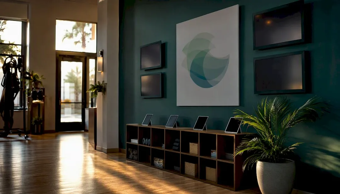
Use a high-quality, real photo of your studio - the inviting reception area, a serene treatment room, or a dynamic class in session - not a generic stock image. If necessary, a subtle gradient overlay can help ensure your call-to-action (CTA) button text remains easily readable against the image. Speaking of CTAs, they should be in your brand colour and use your studio's specific language: "Book Your Yoga Class," "Reserve a Pilates Session," or "Secure Your Recovery Treatment" instead of a flat "Submit."
<h3>Navigation and Forms: Tone Through Every Step</h3>
From menu links to form labels and button states, maintain a consistent tone across booking, payment, and confirmation pages. The client experience shouldn't feel like they've jumped to a completely different website halfway through.
- Your logo proudly displayed in the header, footer, and confirmation screen.
- Primary and secondary brand colours consistently applied to buttons, links, and accents.
- A captivating hero image featuring your actual studio space.
- Consistent tone and language across all forms, labels, and confirmation messages.
<h2>Before You Start: Essential Prep for a Seamless Branding Rollout</h2>
A bit of front-end preparation can save you hours of guesswork and frustration in a theme editor.
Start by getting your image specifications in order. Most booking platforms recommend hero banners around 1920x600px for desktop and a responsively cropped version for mobile. Save photos as JPGs and logos with transparent backgrounds as PNGs or SVGs. Aim to keep hero images under 500KB; a slow-loading banner can actually cost you more trust than a plain one. For favicons, a 32x32px PNG or ICO file is standard, with a larger 180x180px version for Apple touch icons.
Crucially for Australian accessibility, check your colour contrast before committing to a palette. Text on your buttons and forms needs sufficient contrast against its background to be easily legible for clients with low vision. Don't just rely on how it looks to you in ideal lighting.
Finally, draft your microcopy in advance: a concise welcome message, clear cancellation policy wording (especially for your Australian terms and conditions), and simple booking instructions. Gather your logo in both SVG and PNG formats, note your brand's HEX codes, and have your social media links handy.
- Hero images: Aim for 1920x600px (desktop), under 500KB, JPG or PNG.
- Favicon: 32x32px; Touch icon: 180x180px.
- Logo files: SVG and PNG.
- HEX codes: For primary and secondary colours.
- Drafted copy: Welcome message, cancellation policy.
Pro Tip: Before launch, use a free online contrast checker to test your button colours against their backgrounds. A combination that looks perfect in your logo can be almost unreadable as button text for some clients.
<h2>Custom Domain, Subdomain, or Embedded Widget: Which Digital Home Suits Your Australian Studio?</h2>
Choosing how your booking portal integrates with your existing online presence significantly impacts brand perception and control.
A custom domain (e.g., book.yourstudio.com or having the booking tool directly on yourstudio.com) offers the most complete white-label experience and full ownership of the client journey. While it requires a bit of DNS setup, it ensures clients never feel like they've left your digital space. This is often the preferred choice for studios looking for a truly premium, integrated feel.
A subdomain like bookings.yourstudio.com is quicker to configure. It still keeps your studio's name visible in the address bar, clearly associating the booking process with your brand, even if a third-party engine is running quietly in the background.
An embedded widget or iframe is the fastest option for integrating bookings directly into your existing website. However, it can limit the extent of styling control you have, and search engines may not index the booking content as effectively, potentially impacting SEO for specific services.
- Choose a custom domain for maximum brand control, ownership, and a fully white-labelled Australian experience.
- Opt for a subdomain for a quick setup that still clearly displays your studio's name.
- Select an embed if you have a strong existing website and prefer the simplest installation, with bookings living directly on a page within your site.
<h2>Closing the Loop: How to Brand Your Confirmation Emails and SMS Reminders</h2>
Booking communications are where trust is either solidified or subtly eroded. A beautifully branded online portal followed by a plain, unbranded confirmation email feels like a bait-and-switch.
Always set your sender name to your studio's official name (e.g., "Revive Yoga Studio," not "noreply@bookingsystem.com"). Add your logo to the email header and integrate your studio's colours into the footer, along with your contact details and social links. White-label platforms make the point that branding needs to stay consistent across web, mobile, and transactional emails, and clients will notice when it isn't.
Keep SMS confirmations concise: your studio name, the class or appointment time, and a direct link to a branded confirmation page. Receipts and class tickets should clearly state your Australian cancellation policy and location details, all styled to match the rest of your booking journey. Sending from your own domain with correctly configured SPF and DKIM records also significantly improves email deliverability, ensuring your vital confirmations land in inboxes, not spam folders.
- Sender name clearly set to your studio, not the platform's default.
- Logo and brand colours seamlessly integrated into email headers and footers.
- Short, branded SMS messages with links to branded confirmation pages.
- Proper SPF/DKIM configuration for superior deliverability and legitimacy, a critical factor for professional communications in Australia.
<h2>Rolling It Out: Measuring the Impact of Your Branded Booking Portal</h2>
Don't just launch it and hope for the best. A strategic rollout and monitoring plan helps you optimise your branded experience.
- Gather Your Assets: Consolidate logo files, HEX codes, studio photography, and finalised microcopy.
- Pick Your Setup: Decide on a custom domain, subdomain, or embedded widget based on your technical comfort and control needs.
- Apply Your Theme: Integrate colours, fonts, logo placement, and hero images within your booking platform's editor.
- Update Your Communications: Personalise confirmation emails, SMS templates, and receipts.
- Test Across Devices: Crucially, check desktop, tablet, and mobile to ensure logo visibility, button contrast, and overall responsiveness are flawless on every screen.
- Soft Launch and Monitor: Send the new portal link to a handful of trusted, regular clients first for feedback before pushing it live to your entire client base.
Track your booking completion rate, note where clients abandon the form, and observe how quickly they navigate from landing on the page to confirming a booking. A booking website redesign focused on an intuitive, unified experience saw a noticeable lift in user retention, a powerful reminder that visual consistency isn't just aesthetic - it directly influences repeat bookings.
Revively streamlines this for Australian studios by allowing you to set your logo, colours, and hero image directly within its portal editor. You can connect a custom domain or subdomain, and branded confirmation emails are sent automatically. Because Revively is built as a white-label booking portal designed for Australian studios, your Xero-linked payments, GST calculations, class packs, and memberships all operate behind the same professional, branded front door. Nothing looks cobbled together from three different, unbranded tools.
If you're weighing a fully white-labelled setup against a simpler embed, remember that while the white-label route may take a little longer to configure initially, it offers unparalleled control over every single screen a client sees, including GST-compliant receipts and reminder texts.
Pro Tip: Before going live, soft launch your new branded portal to a small group of 5-10 loyal clients. They'll be your best testers, catching any confusing buttons or awkward phrasing before your entire client base does.
<h2>Inclusivity Matters: Ensuring Your Branded Booking Portal is Accessible to Every Australian Client</h2>
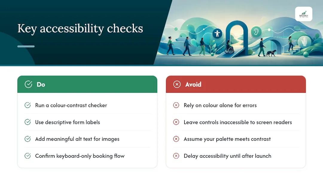
Branding a booking portal effectively means ensuring everyone can use it, including clients with low vision, colour blindness, or motor impairments. A stunning hero image is meaningless if a client using a screen reader can't identify which button books the class.
Always run your colour palette through a contrast checker before finalising it. Text and buttons must stand out clearly against their background, not just look good to someone with typical vision. This is particularly important for wellness and dance studios, as a significant portion of clients seeking recovery or rehab-focused sessions may have vision or mobility considerations directly related to the services they're booking.
Keep form labels descriptive rather than relying solely on colour to indicate errors ("This field is required" is much clearer than a red border with no text). Ensure every image, including your hero banner, has meaningful alt text, and confirm that a client can complete the entire booking flow using only a keyboard, without needing a mouse.
None of this requires sacrificing your visual identity. A well-designed brand palette and an accessible one are often the same; you're simply verifying that your chosen colours meet contrast standards rather than assuming they do. Building this in from the start costs you an afternoon. Retrofitting it after client complaints costs a lot more.
<h2>Optimising for Every Screen: Responsive Branding for Phones, Tablets, and Desktops</h2>
Most bookings for Australian dance, yoga, Pilates, and spa studios now happen on a mobile phone, often amidst other daily tasks. Your branded portal must perform flawlessly on a small screen, just as well as it does on a desktop monitor.
Hero images that appear sharp on a widescreen monitor often need a separate, more tightly cropped version for mobile. Otherwise, your logo and headline text can end up squeezed into an unreadable strip. While most modern booking platforms handle this automatically with responsive image sets, it's always worth checking your hero banner on an actual phone rather than relying solely on a preview pane.
Navigation demands similar attention. A desktop menu with six links will likely collapse into a "hamburger" menu on mobile, and your brand colours must carry through that collapsed state, not just the expanded desktop view. Buttons should be large enough to tap accurately with a thumb - generally at least 44 pixels tall - because a booking button that's easy to click with a mouse can be maddening to tap on a five-inch screen.
Test your full booking flow, from landing page to confirmation, on both a phone and a tablet before you consider your branding complete. A mismatched font size or a logo that disappears on smaller screens can seriously undermine the professional impression you're striving to build.
<h2>Navigating Third-Party Tools: The Nuances of Branding with an External Booking Engine</h2>
Most Australian studios don't build a booking system from scratch. You're customising a platform someone else built, which means your branding options are inherently tied to what that platform allows.
Theme editors on platforms built for this purpose typically let you adjust colours, fonts, buttons, and layout without touching code, with a custom CSS field often available for advanced tweaks if you need something truly specific. Visual, point-and-click branding editors have become a standard feature across reputable booking platforms, which is great news: you shouldn't need a developer just to change your button colour.
The key trade-off to watch for is the depth of customisation. Some platforms let you change colours and a logo but keep the underlying page layout rigidly fixed, which limits how thoroughly you can embed your brand identity. Others, typically marketed as "white-label," give you extensive control over logos, colours, layout, and even the domain itself. This allows the booking engine to genuinely disappear into your own site rather than sitting visibly on top of it. Before you commit to any platform, always verify whether branding capabilities extend to emails and SMS as well as the booking page itself; a beautifully branded booking form followed by a generic confirmation email can undo much of your hard work.
<h2>The No-Nonsense Guide: What to Prioritise First, What Can Wait</h2>
If you're looking at a long checklist of branding tasks, don't get bogged down in custom CSS from the outset. Your logo, primary brand colour, and consistent button styling will do more for immediate client trust in the first ten seconds than any other change. Get those basics live before touching anything more complex.
Your second priority should be your confirmation emails and sender domain. A client who books through a beautifully branded page, only to receive a confirmation from a random "noreply" address, will notice that jarring gap. It erodes more trust than an unbranded booking page ever would.
Third comes your hero image and microcopy - these are the polish that can reduce client hesitation but won't make or break a first booking. Advanced CSS tweaks, custom fonts, and multiple branded themes for different campaigns can absolutely wait; most Australian studios never even need them. Block out one hour to apply your core assets, then another hour a few days later to test everything on your phone and fix any visual quirks.
<h2>Revively's Difference: A Studio-Focused, GST-Compliant Branded Booking Portal for Australia</h2>
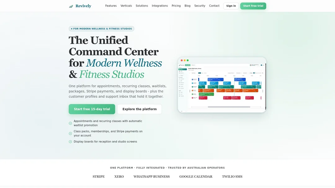
Revively offers Australian dance, yoga, Pilates, and spa studios a comprehensive cloud command centre (CRM + multi-resource scheduler) with a booking portal that seamlessly carries your logo, your colours, and your custom domain through every single screen. From the initial click to the final confirmation email, clients never feel like they've landed on generic, unfamiliar software.
Crucially for Australian businesses, Revively ensures Australian data residency and privacy. All client data, booking histories, and sensitive health digital intake forms are securely stored locally, fully complying with the stringent Australian Privacy Principles (APPs). This isn't just a feature; it's a fundamental commitment to your clients' security and your studio's legal obligations.
Class scheduling, diverse memberships, flexible class packs, digital intake forms, and integrated Stripe payments all reside within one unified dashboard. This means your branding remains consistent whether a client is booking a casual class or signing up for a recurring membership.
Setup is designed specifically for studio owners, no design degree required:
- A user-friendly theme editor lets you manage your logo, colours, and hero image.
- Branded emails are dispatched under your studio's name.
- You can connect a custom domain to keep the entire experience on your turf.
- Our native Xero integration guarantees flawless GST and tax invoice handling. Revively automatically calculates the 10% GST across all casual classes, memberships, and multi-resource packages, issuing legally compliant Australian Tax Invoices to your clients.
- This seamless, automated two-way mapping of tax codes, revenue accounts, and liabilities ensures your quarterly Business Activity Statements (BAS) are always accurate, audit-proof, and free from manual spreadsheet errors. This is your guarantee of 100% legal tax compliance without the headache.
Before you begin, simply have your logo files, brand colours, and a few high-quality studio photos ready. Explore Revively's online booking software for wellness businesses and start a free trial to see your branded, GST-compliant portal live and ready for clients in an afternoon. It's the multi-resource studio scheduling solution Australian studios have been waiting for.
<h2>Sources & Further Reading</h2>
For deeper detail on theme editors and asset specifications, Bookinglayer's help documentation covers no-code colour and layout controls, while Meetergo's branding editor page shows a similar point-and-click approach with domain and email options. For studio-specific setup, Revively's online portal features walk through applying brand assets to a live booking flow.
- Customize your appointment booking pages with AI | Zoho Bookings
- Seamless Brand Experience Your Brand Throughout the Customer Journey | Bookassist
- Get a White-Label Travel Platform with Full Branding Control | ORX Travel
- Triply - Travel Booking Website UI/UX Design | Adventure Travel UI
<h3>Recommended Articles from Revively:</h3>
- Beyond the Widget: Why a Branded Online Booking System is Your Studio's Secret Weapon - Revively
- Branded online booking & portal - Revively
- Integrated Booking Software: The Smart Way to Unify Your Australian Studio - Revively
- The Australian Studio's Guide to Integrated Stripe Booking Software - Revively